Key differences among different timetable views
A quick overview of the many different views on how to embed your timetable or programmation in your event app.
In the Appmiral menu interface, there are different views/screens dedicated to the Artists and Programmation. Based on the feedback from our clients, we've adapted our database in such a way that artists can now become visible in their mobile apps when being announced. That means without an exact day, stage or timing.
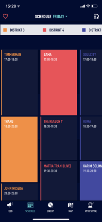
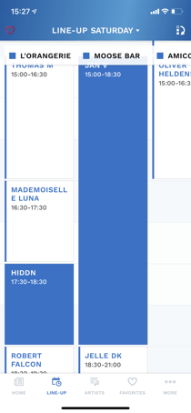
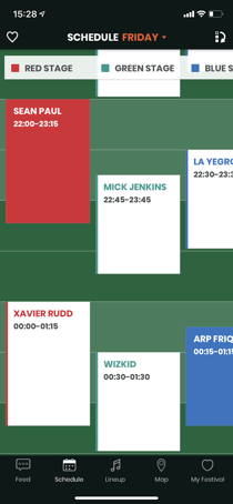
1. Schedule view = typical timetable blocks
This screen allows you to filter by day or by favoriting behavior.
In the right top corner, you are able to reshuffle and prioritize the stages to your musical preferences.
2. Horizontal view = This view is suggested for events that have 3 or more stages
Stage names appear on the left side and we can scroll to the right to see all performances. You can change edition days on the top of the screen.


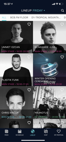
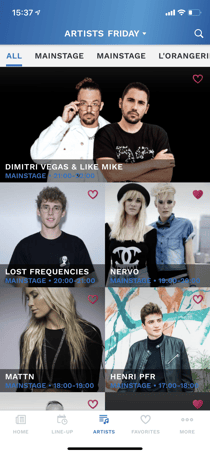
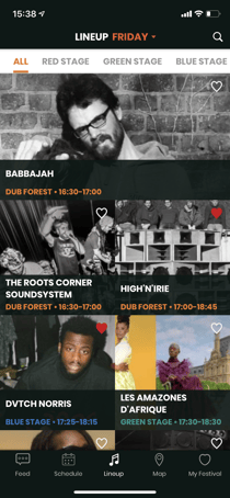
3. Lineup view = artist images with data
This screen is more visual than the timing blocks from the schedule view.
This is great for understanding and exploring who's paying when and where. As they say, sometimes a picture says more than a thousand words.
4. Artist view = artist images without data
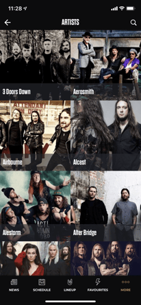
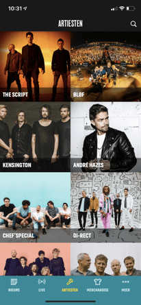
Different than on the Lineup view, you can't filter on day or stage. This is just a visual list filled with images linking to all the artists playing at your event.
This screen is ideal to use upon the first announcements or when your audience just wants to explore all the artists in an easy way.
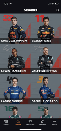
5. Calendar view = agenda-like overview of events
A similar view to the lineup view but with bigger placeholders. This is more of a list view ideally for conferences or venues to add their calendar to the apps.
The larger image space and accompanying text placeholders can be more suitable for some organizers than the classic lineup view.
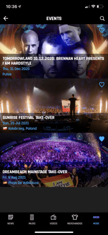
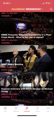
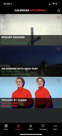
6. Scrollable calendar view = This view is suggested for events that last for extended periods of time
This view will showcase edition days on top that can be scrolled horizontally, and the list of events changes below.
7. List view = This view is suggested for artisis who perform multiple times.
This overview may be used to simplify the schedule and display performances chronologically
8. Multiple schedules, Lineup, Artist views = We are now able to segment the schedule, artist or lineup views to accommodate different activities happening throughout the event.
This can be used for food vendors, activities, separate venues etc. With these views you can separate the schedules into different menu options, so users can easily find timings for diverse activities. Additionally, we can have the same view or a mixture of the views aforementioned for these menu options.


